Round 1: ten directions for the results screen
Design exploration, 11 Oct 2026. Ten ways the results screen could look. Set aside because every one showed too much at once; see round 2.
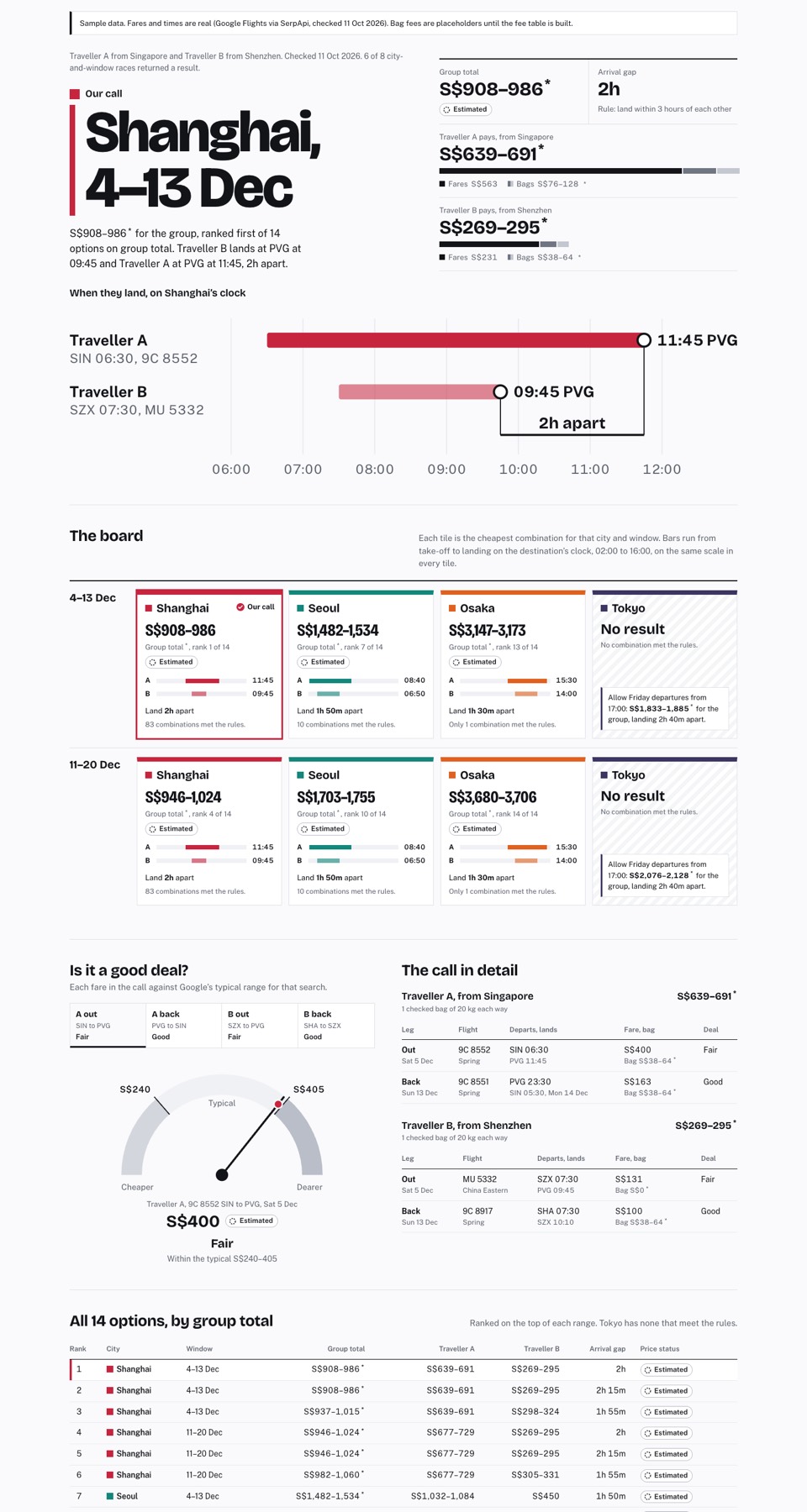
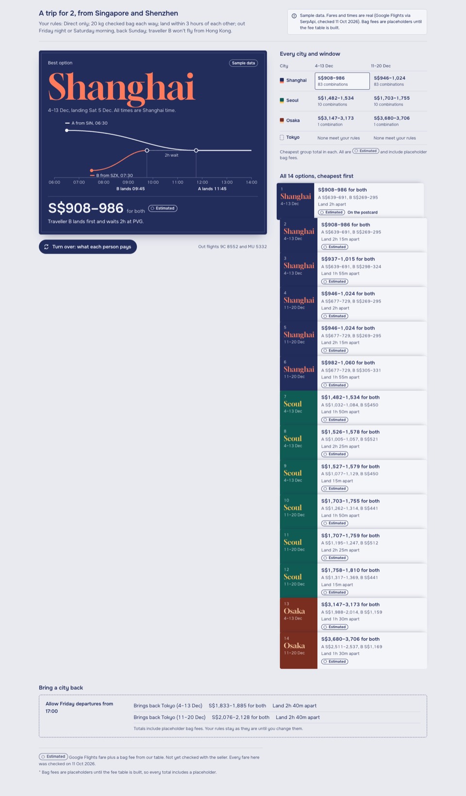
Sample data. Fares and times are real (Google Flights via SerpApi, checked 11 Oct 2026). Bag fees are placeholders until the fee table is built.
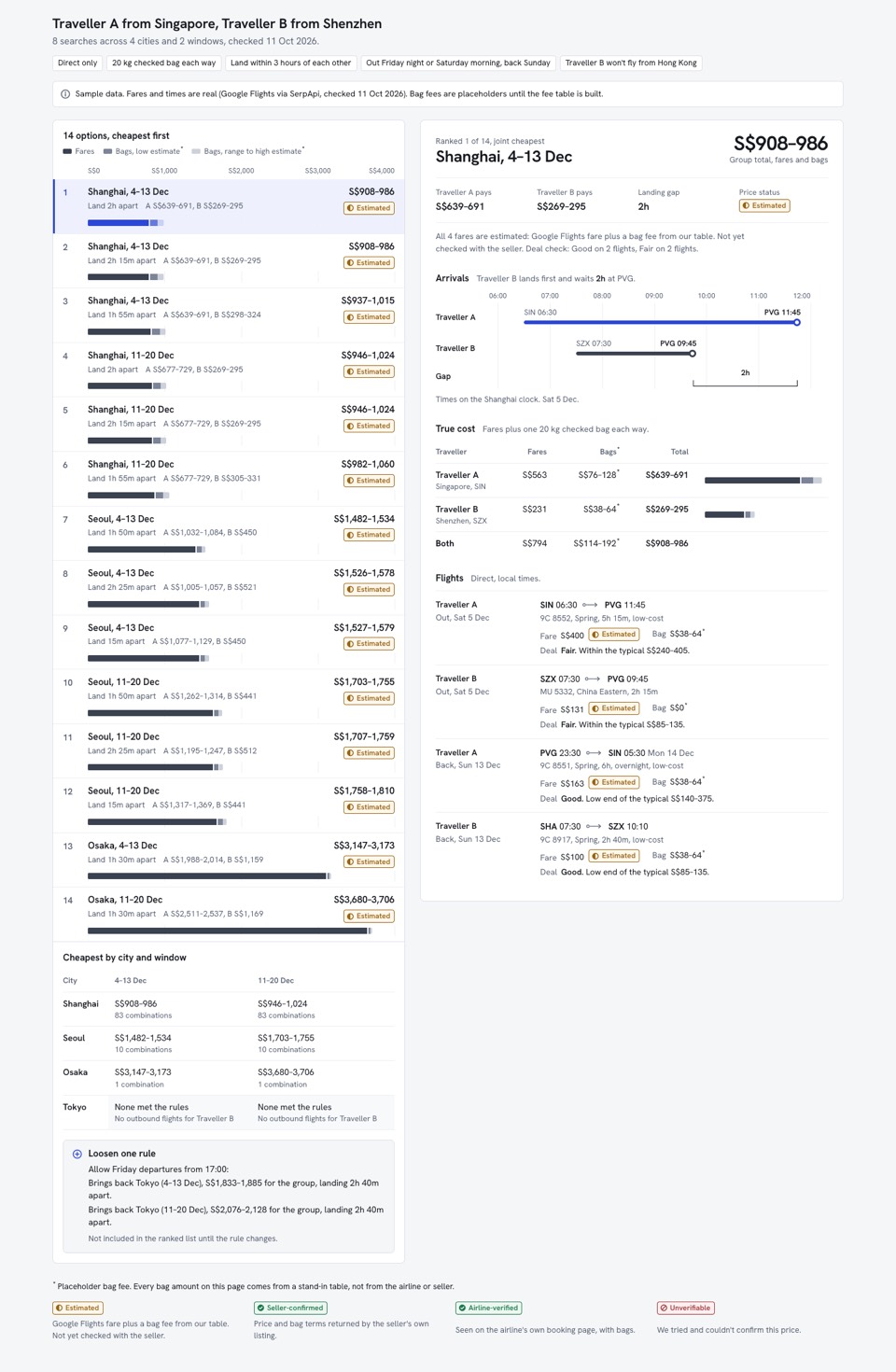
- 1LedgerThe category standard at full craft: ranked rows, detail beside them.
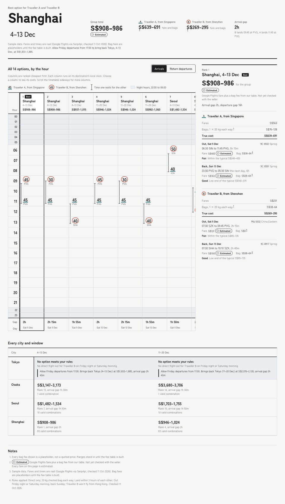
- 2TimetableTime leads: arrivals written into hour rows like a station timetable.
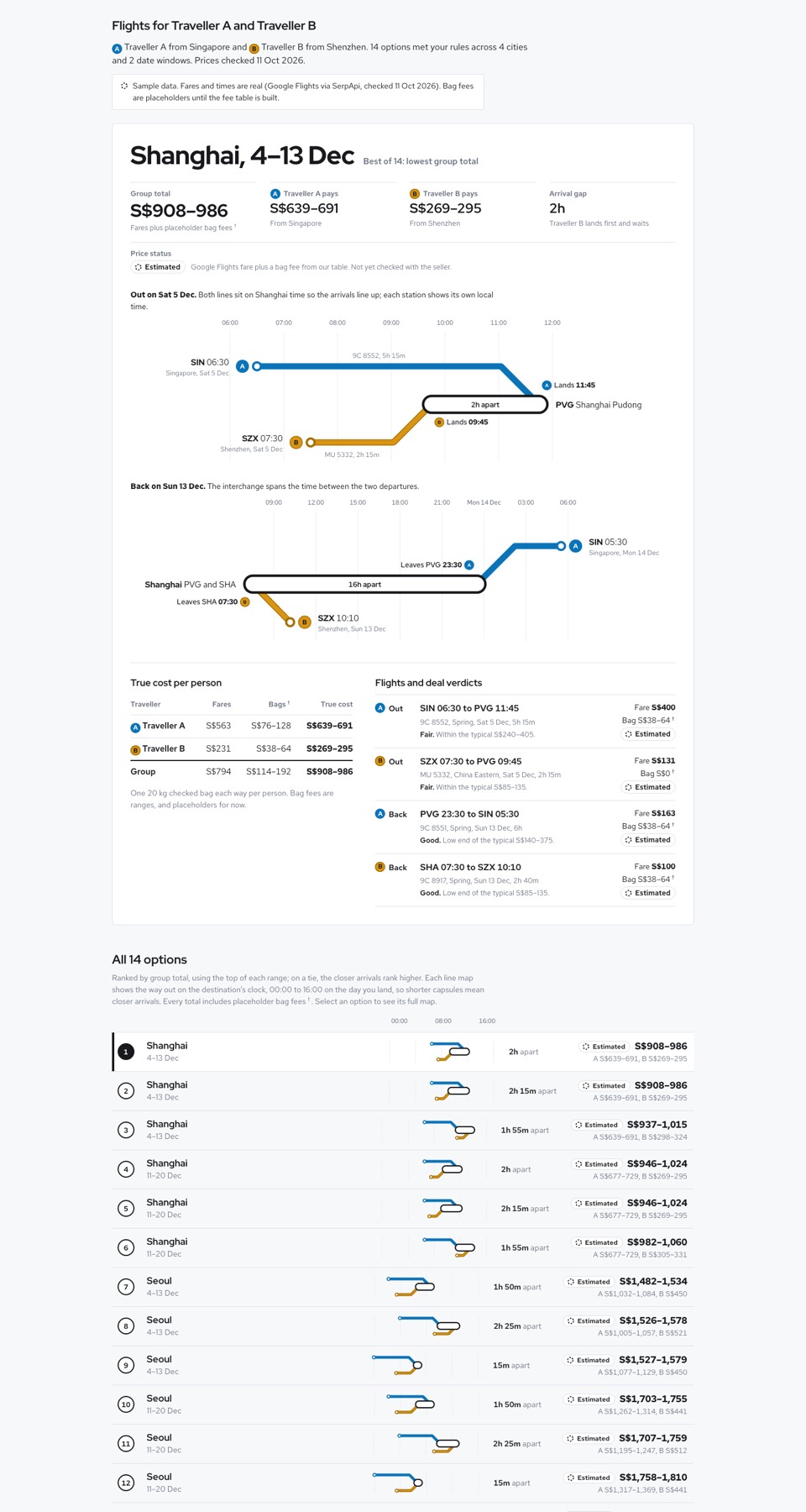
- 3InterchangeConvergence leads: each traveller is a metro line meeting at the destination.
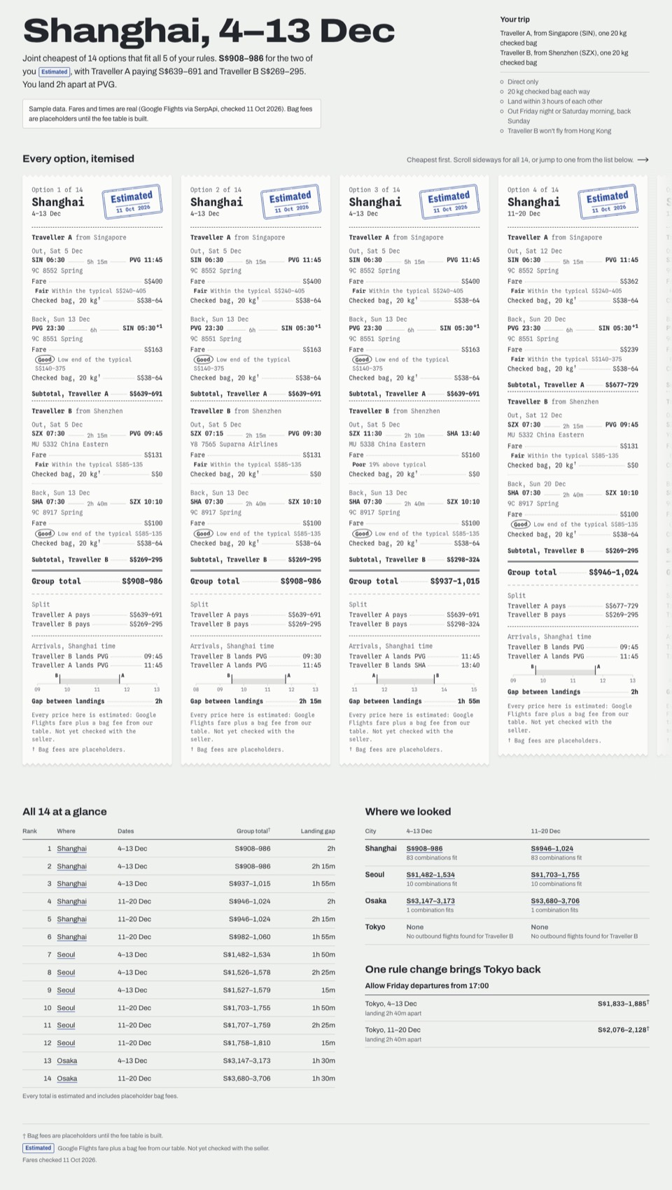
- 4ReceiptTrue cost leads: every option is an itemised bill with stamped statuses.
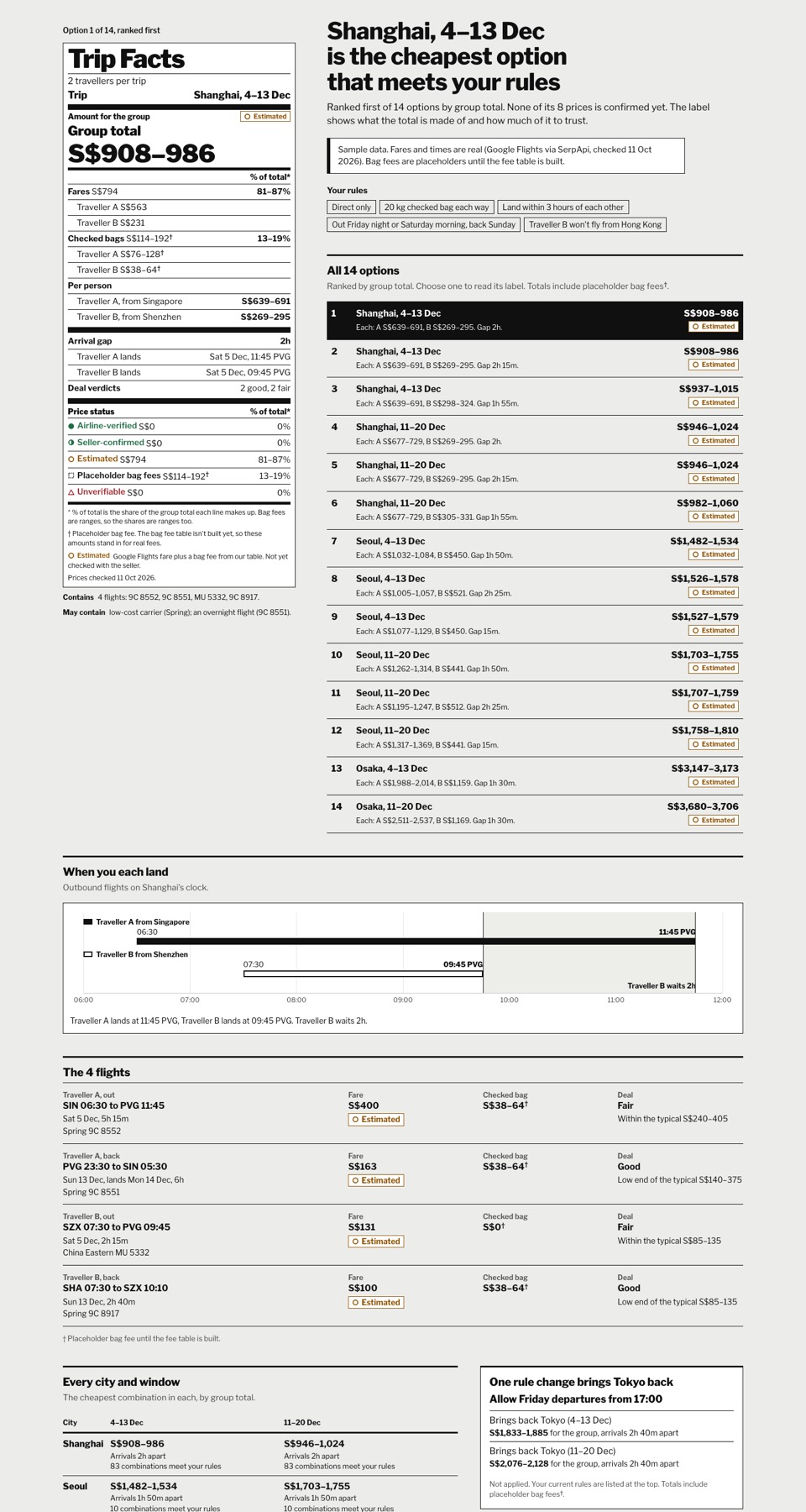
- 5Trip FactsHonesty leads: a nutrition-label panel of what's confirmed and what isn't.
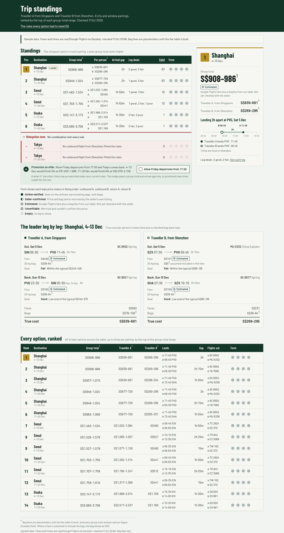
- 6League TableRanking leads: cities as a league, with a relegation zone and form guide.
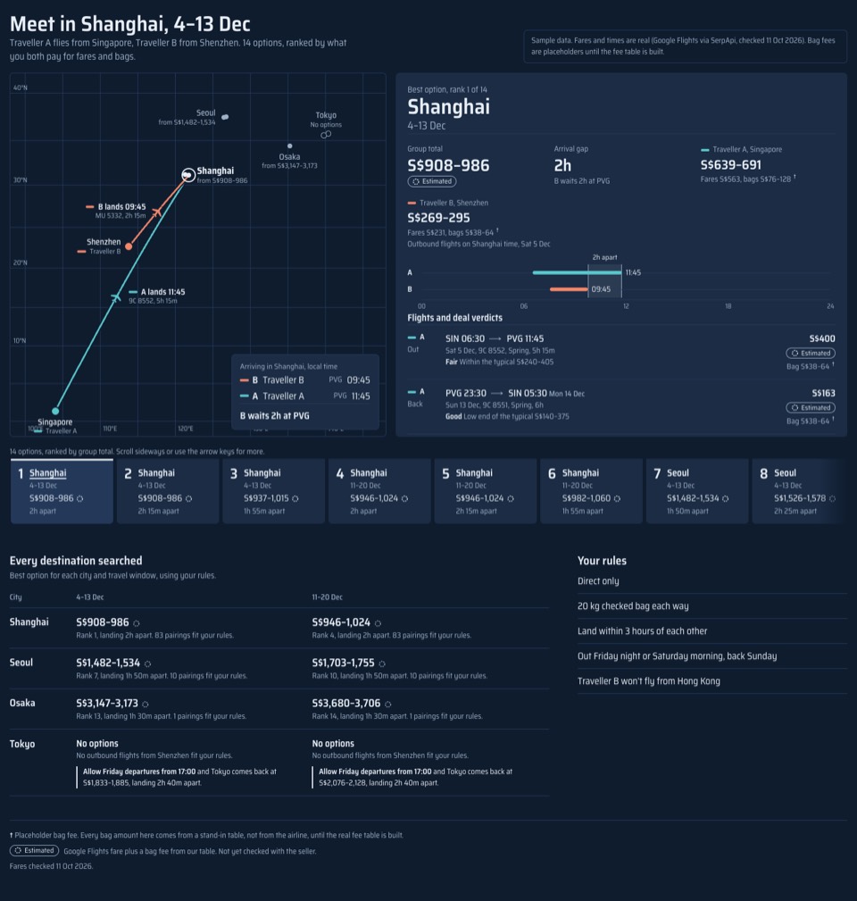
- 7Moving MapGeography leads: both journeys as arcs converging on a seat-back map.
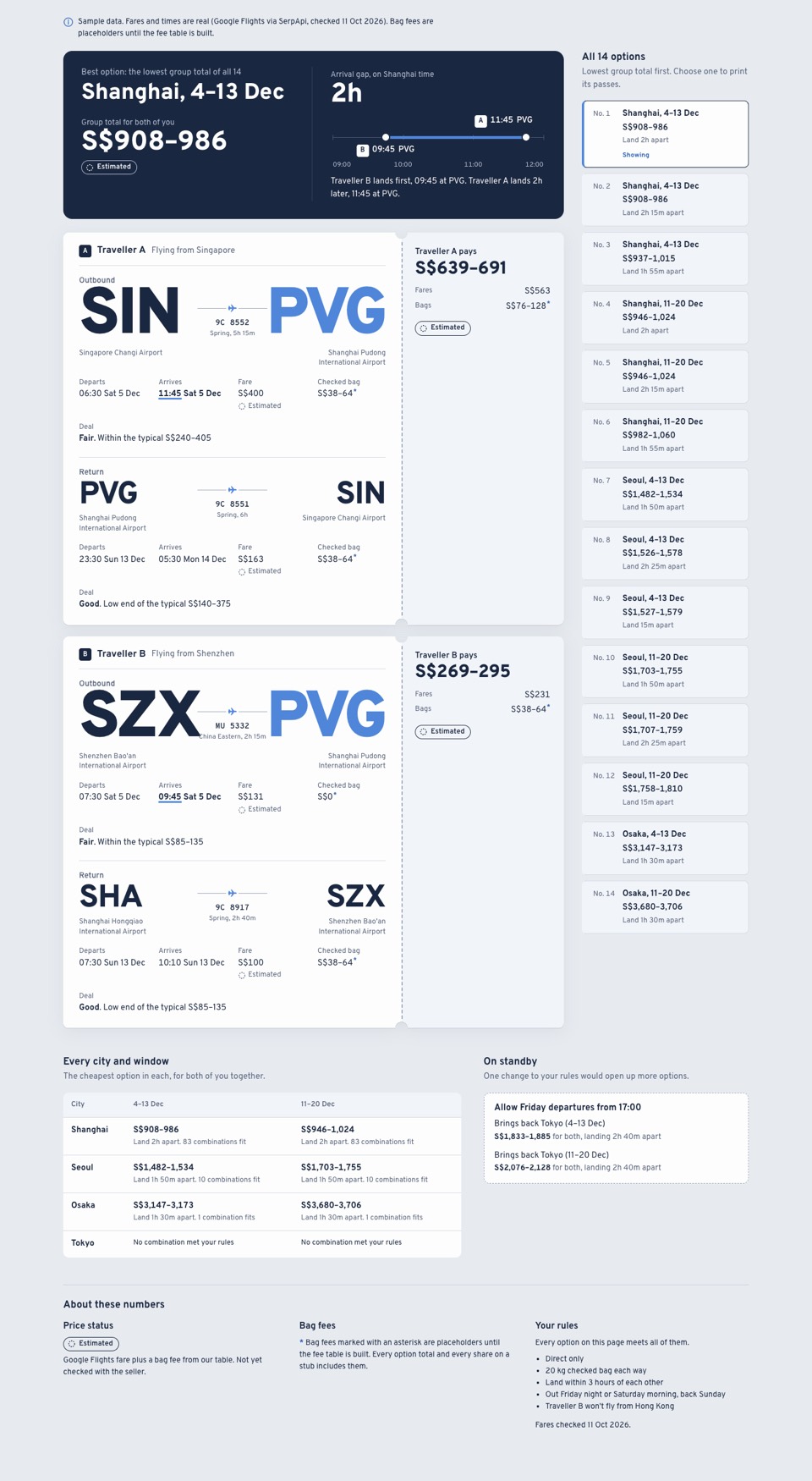
- 8Boarding PassesEach person leads: one pass per traveller, their total on the stub.
- 9Results NightThe overview leads: all eight races as an election-night board.
- 10PostcardSharing leads: the result as a postcard that flips to show the split.